Showing posts with label layout. Show all posts

Wednesday, February 21, 2018

Journey {Scrapy Land #84}


It's time for a new Scrapy Land Challenge and I decided to create a monochromatic scrapbook layout.  I used the following dies to embellish this layout:

Frantic Stamper: Journey
Frantic Stamper: Sphinx and Pyramid
EK Success: Travel
Die-Versions: A Little Lime font

The papers are digital and are by Carta Bella (Transatlantic Travel).  I started off by printing the digi paper twice.  The first one is the base page for the layout and the second printing was so that I could die cut from it.


The "Journey" sentiment was die cut five times (four from white cardstock and once from the printed paper) so that I could get a lot of dimension.  I also used a COpic marker to darken the sides.  I could have die cut one more layer from black cardstock to get basically the same effect.  The Sphinx was die cut twice, once from the patterned paper and once from black cardstock.  I added a pop dot under his chin for more dimension.

The Pyramid was also die cut from both black cardstock and the printed cardstock for a shadow effect.  The bottom right corner is pop dotted for a more realistic look.  I chose this die as there is a glass pyramid in front of the Louvre Museum.

Le Louvre was die cut three times for more dimension (2 times from white cardstock and once from the printed cardstock) and the edges were highlighted with a Copic marker.

The geo tag, which points to Paris on the map, is part of the EK Success Travel set and was also die cut multiple times for added dimension.

I enjoyed creating this "non-traditional" layout and you will probably be seeing more in the future.  😄


Be sure to check out all the new designers' projects and then upload your own project to the Scrapy Land Challenge.  There are two winners, each of whom will receive a $10 gift certificate to go shopping at Scrapy Land.  The theme is Anything Goes using any brand of die that Scrapy Land sells.  You have until March 4 to play along with us. 😀



Monday, June 10, 2013

Fun in the Sun


This month's new release from Die-Versions is all about Summer Vacation.  I've incorporated two of the new dies into my layout: Fun in the Sun Sweet Spot and the Sandcastle Sweet Petite.

The Sandcastle die cut is covered with Mudd Puddles Tropical Beach for a realistic looking and feeling sandcastle.  I also added some Mudd Puddles Seasehlls below the die cut and more of both in the flower centers.

The date was added using the Die-Versions Make A Date 1 Compliments die.


Be sure to visit the Die-Versions Blog to see all the new releases this month as well as the Die-Versions Facebook page.  We'd love to see your Die-Versions creations on our FB page.

Friday, January 4, 2013

Zendoodle Flowers layout


Today I lave a layout that incorporates the Zendoodle Flowers rubber stamp set from Sparkle N Sprinkle, washi tape, dies, Distress Stains, flock, and lots of glitter.  I have to say right off the bat how hard it is to capture all the dimension and sparkly glitter that's on this page.  So I've got several photos to try to do just that.

 The first thing I did was to add some texture/interest to my solid piece of cardstock by applying Distress Stains (Picked Raspberry) directly to a piece of bubble wrap and randomly laying it down on the cardstock.  For the doily (from Cheery Lynn Designs), I applied the Distress Stains to my craft sheet, spritzed it with water, and ran my white cardstock through the puddles.  This gave it the contrast I was looking for.


I ran a leaf ribbon up the left side of the page and added the Zendoodle Daisy and Zendoodle Leaf multiple times (after fussy cutting each of them out).  I also added the Stem Daisy around the photos.  All of the flower heads are pop dotted for added dimension, as well as one of the butterflies.  The rest of the butterflies are stamped directly onto the cardstock base.  My sentiment is from Die-Versions Make-a-date die. (Since the dates don't go back that far, I cut and pasted the year together.)  The banner is both washi tape wrapped around a piece of twine and glittered Tear-ific tape (see how to do this here in the SNS Tips and Techniques section).

For more detailed instructions, you can visit the SNS gallery, here.


Thursday, December 27, 2012

Party Time


It's time to start counting down till the New Year and to help you Die-Versions has some great New Year's dies.  Since Die-Versions dies are so die-verse (thanks Suz!) I decided to create a bithday themed card and layout with a couple of the December new release dies.

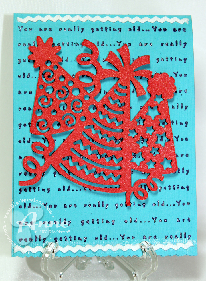
First up is the Party Hats and I created a simple and quick card for someone of any age.  (I really love that subtle background stamp from River City Rubber Works.)  I pop dotted the image for added dimension.  I didn't stop with decorating the outside either.  On the inside of the card, I used the Sparkler font and some of the negative portions for the hats.


 Next up are the Party Horns and again, I thought of birthday instead of New Year's celebrations.  Just shows how versatile these dies really are.  I created a layout of my husband's birthday a couple years ago (I'm really behind on my scrapbooking).  To create the title, I used the Party Pennants 1 banner and the Tick Tock font.  I carried the pennant idea down to anchor my party hats that are closer to the photos.

I also used all the negative portions of the die and colored them with Smooch inks.  The finishing touch is some tomato red tinsel glitter from Sparkle N Sprinkle for lots of bling and added dimension.

Head on over to the Die-Versions Blog to see the fabulous New Year's projects the rest of the team created!

Tuesday, November 27, 2012

Grand 2013


Did you see the new Black Friday die release from Die-Versions?  If not, you need to go check them out (after you finish reading my post of course :-P).

This is the new Grand 2013 die and boy, is it grand!  I thought it would be fun to create a birthday calendar using this die.  I'm planning on writing my friends and family's name on the corresponding line for the date and month.  Now there won't be any excuse for me not sending out happy birthday wishes.  I created my own glitter papers (see my post using the Ornament Trio die on 11/20, for details on how to make your own) in both red and silver.  As you can see, I die cut the silver and used the red for the background.


The digital image calendar is by Clear Dollar Stamps and it's so versatile and I printed one for each month, although I'm only showing a couple so you get the idea.   I added stickers that I've had in my stash for ages to the centers of each month.

I also think this die would be great on a layout - maybe celebrating the beginning of the New Year, or the Fourth of July perhaps.  This is for the upcoming New Year and I incorporated the Die-Versions' New Years Collage die with my design.

When I first saw this die, I knew I wanted to try something totally different and I'm SO happy that it worked out!  I created my own stencil with chipboard so I could use embossing paste.  It works the same way as a metal stencil and embossing paste does.  (Except that I couldn't re-use it again.  If I had been a bit neater, then it probably could have been reused after everything was dry).


You can really see the dimension the embossing paste gave the layout and how crisp everything turned out.  Originally, I was planning on adding some color to this after it dried, but I liked it so much in white, that I left it as is and then worked up the layout using white accents.  I did spritz it with Perfect Pearls for a bit of shimmer though (that's what the small splotches are - not embossing paste).  Sometimes I can spritz and get a nice fine mist and other times I get splotches - I prefer the fine mist!


Now you need to visit the Die-Versions store and the Die-Versions Blog to see all the Black Friday dies and projects.


Friday, July 6, 2012

Just Because


I thought I would share something that I haven't done too much of lately: a layout.  Why, you ask?  Just Because!

This design is so versatile in so many ways.  For one thing, it's a great way to use your scraps that are piling up.  You can mix and match your papers or go with a monochromatic theme, or what ever strikes your fancy.  Another thing about this design is that you can use a vertical or horizontal photo or multiple photos.  And this design works well for both girls and guys.

The steps to make this layout are pretty simple.  The hardest part was deciding which scraps I wanted to use and what my color scheme was going to be.  The title of the layout was created with a Stampendous rubber stamp that I inked with Festive Berries Distress Ink and heat embossed.  A Spellbinders' scalloped die was then used to cut it out.  On a piece of scrap paper, I sketched the placement of my rays and where the title was going to go.  This became my pattern pieces to cut out the designer papers.  After everything is cut, I began the assembly process.

I actually worked from the bottom up and layered my pieces in a block design.  I added a bit of texture to the solid cardstock (the panel to the left of the photo) with Goosebumps Texture Spray.  For more pizzazz,  I masked off the rest of the layout and applied VersaMark and clear embossing powder to the sun burst rays at the top of the layout, giving them a very shiny appearance.  As a final touch to the rays, add a bit of faux stitching.

I matted the photo so it would stand out more, adhered my title, and began adding the embellishments.  The tab and sentiment are computer generated and cut out; the circle border is a My Favorite Things die (Dainty Dots border); and a bit of Washi tape (My Mind's Eye) is the final touch.


Wednesday, May 2, 2012

Sun and Surf


It's the first Wednesday of the month, so that means it's time for a new challenge from Dude Time Doodles.  This week's challenge is all about sports.


Living in the South, most everyone lives for football.  Other sports (basketball, baseball) are fillers until college ball begins again.  Since I lived in California for many years, I immediately thought Waylon Waves  would be a fun image to use for sports day.

After coloring with Copic markers and fussy cutting,  I pop dotted Waylon onto Creative Memories paper cut with Spellbinders Labels Ten.  As I was trying to decide how to make the card base, I found this piece of Echo Park paper (Splash collection) in my stash and it started screaming to be made into a layout.  I used to do layouts all the time, but not so much anymore.  There are probably less than five posts on my blog with layouts.  But it's fun to do something different for a change.  I kept going through my stash and adding layers that coordinated.  I even have a pocket tag for journaling (or another photo).  On the Bazzill cardstock base, I randomly painted watered down gesso for a fun look.  The border on the side is from Lifestyle Crafts.  Nothing fancy or formal, but low key - just like a dude ridin' the waves.

One final note, for those of you afraid to use glitter on your guy creations, don't be.  If you look closely, I've added PK Glitz glitter to the white cap and parts of the water.  Gives a very shimmery look to the layout.

You have one week to upload your Sports themed project to the Dude Time Doodles challenge blog.  Remember, it needs to be for a Dude.  Can't wait to see what sport you use.

I'm entering this in the following challenges: That Craft Place (one for the boys); The Crazy Challenge (summer/beach); Ooh La La (make it manly).


Copics used: E01, E11, E13, BV20    YG91, YG93, YG97    YR12, YR15, YR18, FVG2    Y23, E51, Y38, E55    E51, E53, E55, YR14
PK Glitz: White Pearl, Tanzanite, Aquamarine

Tuesday, November 2, 2010

Fall Splendor


Edited: Fall Spendor was published in the February, 2011 edition of Scrapbook News and review Magazine.

For a change of pace, I decided to share a layout I made for the Stash Challenge over at Challenge Masters.  You had to use die cuts that were already in your stash (you couldn't cut them specifically for this project). 

The photo is a cluster of trees in my yard taken last fall (it's been too hot and dry this year for any great changes of color).  I hand-stitched concentric circles, using both paper floss and embrodery floss.  Then I added the photo and my die cut leaves.  The title in the bottom left says "joys of the season".  I love to see the changing leaves every fall.  Granted we don't get nearly the degree of color in the South as they do in Vermont, but it's still gorgeous here.

Here is a close up:


Monday, January 11, 2010

Documenting Firsts...

As any scrapper knows, you should always create a layout of  "firsts", whether it's a first tooth, first hair cut, or first time your project was published.  Since I'm a scrapper too, here is my  layout for my "first".  The letters are cut from the Cricut cartridge - Stamped and I sprayed the word "published" with Smooch Spritz -silver foil.  I like the Smooch Spritz much better than Glimmer Mist.  The nozzle doesn't clog up and the colors are vibrant.  This gave the letters an extremely shinny/glossy look (but hard to photograph).   The news man in the top left corner is a rubber stamp from a company called My Heart Stamps For You.  I colored him using Copic markers.  The patterned paper is Basic Grey and the solid paper is from Creative Memories.  Labels 7 from Nestabilities was used for my journaling box.