Wednesday, June 12, 2013

Quilted Berries


I wanted to try something a little different with the Sweet Berries rubber stamp set from Sparkle N Sprinkle.  Since I had just come back from a quilt show with my mom, I decided I wanted a quilted look, but wasn't sure how I wanted to achieve it.  Enter my postman and the goodies he delivered.  Sitting out on my desk was a new M-Bossabilities folder (Garden Lattice) that will emboss a 8.5" x 11" sheet of cardstock.

I started out by heat embossing my image with Moss Star embossing powder and then colored it with Copic markers.  You can see a little of the sparkle from this embossing powder in the photo on the right - but it has more sparkle in person. Then I ran it through the embossing folder.  I happened to set it on top of a "test run" piece of embossed cardstock and knew that was exactly what I was looking for.

I layered the colored image onto dark blue cardstock and then lined it up the embossed area of the larger piece and adhered it.   Dylusions Ink Sprays were used to give color to the circle with my stamped sentiment.  (These stamps are part of the set.)  The final step was to adhere this to another piece of white cardstock and add some faux stitching to the two inner white panels and the circle.

Monday, June 10, 2013

Fun in the Sun


This month's new release from Die-Versions is all about Summer Vacation.  I've incorporated two of the new dies into my layout: Fun in the Sun Sweet Spot and the Sandcastle Sweet Petite.

The Sandcastle die cut is covered with Mudd Puddles Tropical Beach for a realistic looking and feeling sandcastle.  I also added some Mudd Puddles Seasehlls below the die cut and more of both in the flower centers.

The date was added using the Die-Versions Make A Date 1 Compliments die.


Be sure to visit the Die-Versions Blog to see all the new releases this month as well as the Die-Versions Facebook page.  We'd love to see your Die-Versions creations on our FB page.

Friday, June 7, 2013

School of Fish


Fishing with Dad is one of the new stamp sets from Sparkle N Sprinkle.  The technique used on the first panel is a new one introduced on the SNS Blog a few weeks ago - Stains and Shimmer.  I modified it just a bit and used Distress Inks on the base and used Distress Stains for the shimmer.  The embossing folder is an old Cuttlebug folder called Spots and Dots.

To create the fish, I tried my hand at using a brayer.  Although I've had it for a long time, I've never gotten around to trying it but was inspired by some of the beautiful pieces by Shona on the design team.  For my first attempt, it was't bad but it wasn't as smooth as I would have liked.  (Guess I need to practice some more.)   After brayering the ink onto a piece of cardstock, I added Opaline embossing powder and heat set it for a shimmery look.

Next, I stamped the fish image multiple times and fussy cut each one of them out.  I also stamped the fish directly onto the background (but it's hard to see them in the photo).  I pop dotted the colored fish, added a few brads, some netting, and a die cut anchor by MFT to complete my undersea scene.

Wednesday, June 5, 2013

Birthday Wishes


I have to say that I think this Silhouettes stamp set from Sparkle N Sprinkle is one of my favorites as it is so versatile.

For this birthday card, I started out with a vintage book page and I heat embossed the image with Clear Detail embossing powder.  Then out came the Distress Inks (Vintage Photo and Gathered Twig) and I just started adding ink to the paper with my blending tool.  Once I was happy with the results, I wiped a paper towel over the embossed area to get the excess ink off.  (This is called the clear resist technique).   I colored a few pearls with my Copic marker, added a bit of yarn and adhered it to my panel.  The sentiment is heat embossed with Brown Fizz embossing powder.  Even though the image is flowers, I think it has a nice masculine feel to it.


Monday, June 3, 2013

A Prayer for You


The Sweet Seahorse Whispers die is one of 19 new releases this month from Die-Versions.  This CAS card pairs the Seahorse die cut with a rubber stamp sentiment from I Brake For Stamps on kraft paper.  A double looped bow finishes the card off. 

Be sure to visit the Die-Versions Blog to see all the new dies.

Saturday, June 1, 2013

Irish Blessing


Can you believe June is already here?  Well, you know what that means....summer and a new Sparkle N Sprinkle Creative Challenge.  This month we're following a sketch.


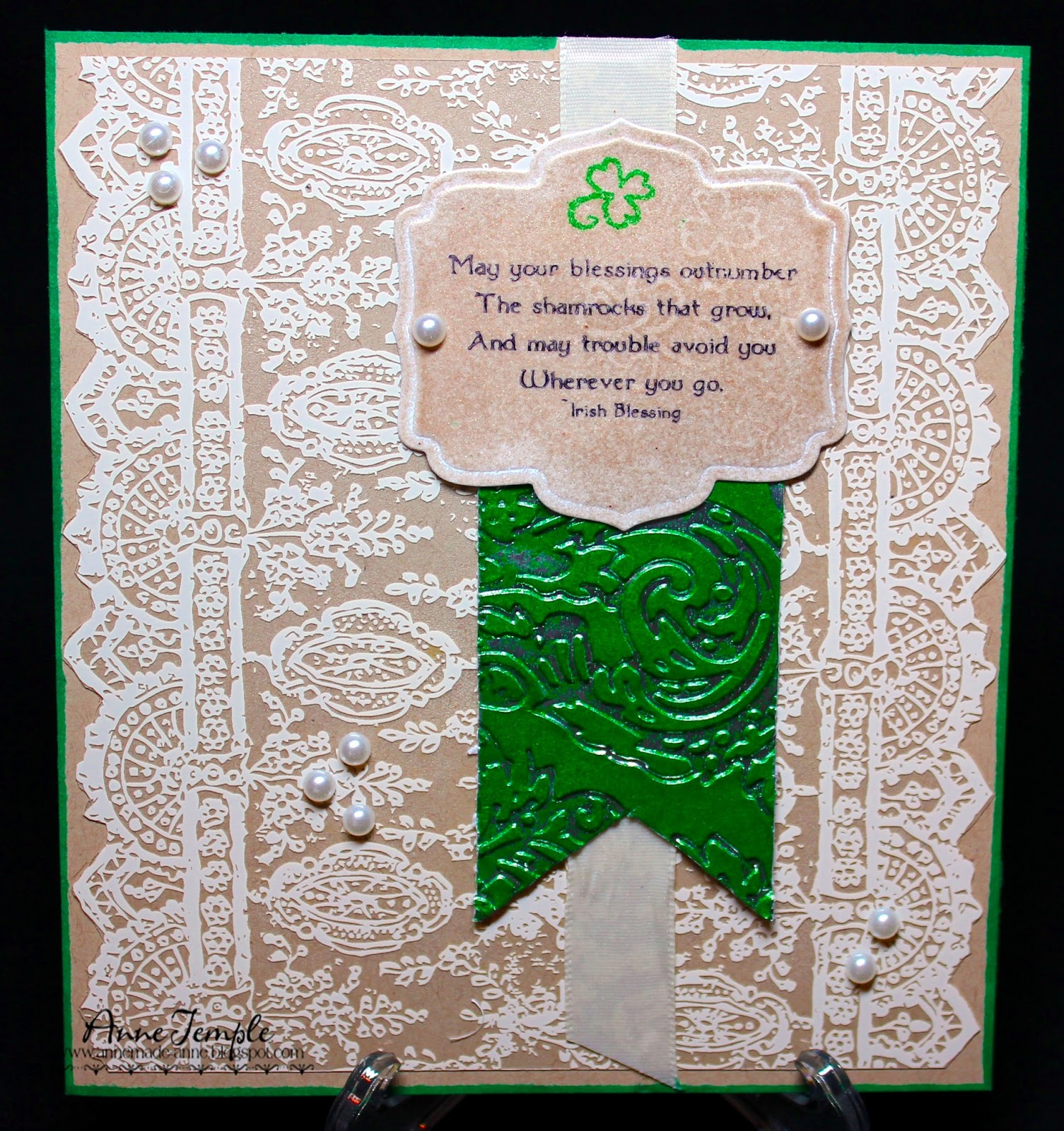
As you can see, I followed it pretty closely.  The focal point is one of the sentiments from the Irish Shamrocks rubber stamp set from Sparkle N Sprinkle.  After die cutting my cardstock using Spellbinders Labels Five die, I covered it with VersaMark and Vintage embossing powder.  Once it was heat set, I stamped a shamrock (the stamp actually has three of them) with Versamark and Forest Green embossing powder and used the Molten Pearls technique of embedding the embossing powder into more embossing powder.  Then I stamped the entire shamrock stamp with VersaMark and heat set it again.  This gives it a fun watermark.  The sentiment was then stamped with Staz-On ink.

The green embossed banner is actually metal tape that I adhered to cardstock.  I ran it through my Sizzix embossing folder (Regal Flourishes) and then tapped VersaMark on the raised portions.  I covered it with Forest Green embossing powder and heat set it.  The metal stayed silver in the recessed portions.  The backdrop is a Hambly Screen print (acetate with a design) and the card base is kraft paper.  I thought it went nicely with the Vintage embossing powder.

Now it's your turn!  You have the entire month of June to come up with a project following the sketch. Can't wait to see what you make.

Wednesday, May 29, 2013

Speedy Recovery


One of the things I loved about being a cake decorating instructor was making realistic flowers out of fondant and gum paste.  (I've been making my paper roses with some of my old Wilton tools used to create roses out of fondant for quite some time now.)  So when I saw the new Susan's Garden dies from Sizzix, I knew I had to try them out.  Well, I'm hooked.

The first flower I made was the Poppy and I paired it with a sentiment from Sparkle N Sprinkle's Just For You stamp set.  I used Pan Pastels to ink up the flower as well as the red mat (all the mats are Timeless Rectangles by Spellbinders).  The sentiment was stamped in VersaMark onto vellum and heat set with Japanese Lacquer embossing powder.   I added a bit of Viva Decor's Pearl Pen (Salmon) to the Poppy center and on either side of the sentiment.  I also die cut four extra leaves and adhered them behind the triple loop bow.  The ribbon is a very pale cream color and needed just a little something extra behind it.


Monday, May 27, 2013

Go Navy!


This new Ship Sweet Petite die from Die-Versions just screamed "make me into a football card", so I did. :-)  The football is a digital image that I colored with Copic markers and added the ship in front of it.  I hand cut the pennant and added twine all around for a border.  The Die-Version font inside is My Micro and the "Go Navy" font is Landmark.  I don't know how many people would think about football when seeing this die, but it was one of the first things that came to my (warped) mind. 

Check out the Die-Versions Blog and the Die-Versions Facebook page to see what the rest of the team is creating.  You can also upload your own Die-Versions projects onto the Facebook page.  We'd love to see what you create!